MARIAGE FRÈRES
WEBSITE REDESIGN CASESTUDY
A self-initiated project taken on under the mentorship and guidance of a senior UX designer to highlight, study, discover, come up with solutions for a real life project. This case study took approximately 2.5 months to complete. It gave me a good opportunity to apply different tools in various phases of the project from beginning to end. I was able to analyze and determine what some of the problems are and come up with solutions and test them to improve the user experience.
Founded in 1854, Mariage Freres is one of the oldest tea houses in the world. They are a premium gourmet tea company based out of Paris. Their blends are inspired by traditional French culinary and wine traditions. The brand has become synonymous with French tea culture.

BRIEF
We are working with Mariage Freres, which is one of the top tea brands worldwide. Due to the Covid-19 situation, the brand shops were closed and customers didn’t have the usual experience of buyng tea offline so they are planning to optimise the website for selling tea online.
Main objective: Increase the conversion rate of their website.
APPROACH
We used a Double Diamond approach to understand the users and their problems and to explore and come up with creative solutions which we later prototyped and tested.
We employed a few different tools under each phase of divergent and convergent thinking to help us.


Discover
Company business model
Trend research
Competitor research
Heuristics analysis
Moderated user testing
Define
Identifying top problems
Creating How Might We questions
UX benchmark on competitors
Develop
Crazy 8 solutions
Dot voting
Wireframing
Deliver
Prototyping
Testing
Iteration
DISCOVER
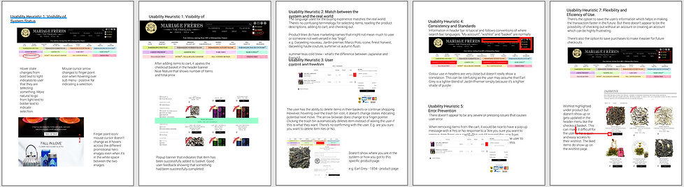
Heuristics Analysis
Moderated User Testing
I started off with performing a heuristics evaluation using Jakob Nielsen's 10 general principles for interaction design to identify some of the key usability issues of the current site and the impact on the overall user experience.
I recruited a few test subjects who fall into the target market demographics of the company. I gave them a specific task which was to find a particular item, add it to cart and checkout. I observed how they would approach the task and noted their frustrations. After the task was complete, we would review their steps and noted their reasoning for each step they took. Their additional feedback concerning usability were also noted.
DEFINE
Identifying top problems
Comparing the results and observations from the user tests and the heuristics analysis, some glaring issues were revealed. 3 out of 3 users found the current site confusing and chaotic. We listed the top 5 UX problems based on the user test and heuristics analysis that caused the most frustration for the user.
Creating
How Might We
questions
Based off of the problems we identified, we carefully crafted How Might We questions to frame the problems for the ideation phase:
- How might we provide the right information that drives the decision making?
- How might we create a digital experience that’s coherent with an in-store experience?
- How might we create a smooth experience at checkout?
DEVELOP
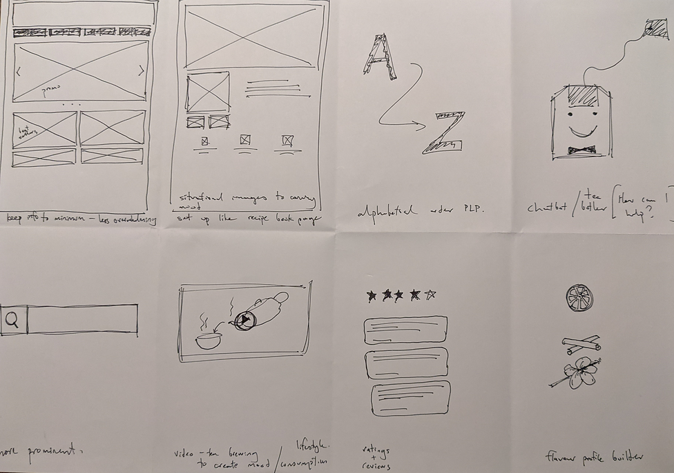
Crazy 8 solutions
Moving into the ideation phase, I employed a tool typically used in design sprints, Crazy 8's, to come up with 8 solutions in 8 minutes for each of the How Might We questions we came up with earlier. The goal was to come up with a wide variety of solutions to address each problem.
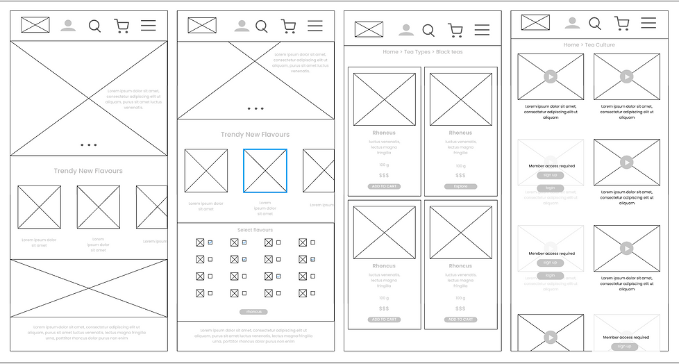
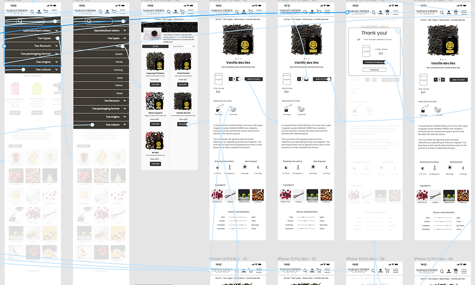
Wireframing
I created wireframes to mock up some of our potential solutions to get an idea of what the new design would look like. The decision to wireframe in mobile was made so that it would be easier to scale up when developing a desktop version later.
DELIVER
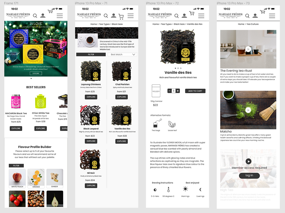
Redesign
New designs took into account user feedback and addresses the top issues as defined earlier in our process from our heuristics analysis and user testing. This included a cleaner and simpler navigation menu leading to more clearly laid out products and product information.
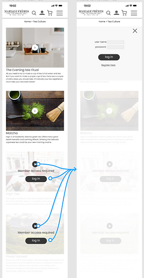
I also created and tested two product offerings to help novice tea drinkers navigate the complexities of choosing a tea and to learn more about tea culture.
Prototyping
and Testing

I then created some high fidelity working prototypes to test and see if the user experience has been improved. I recruited another batch of users that are within the demographics of the target market. They given some tasks and observed and their feedback was gathered at the end.
Final output
The feedback from the user test revealed some interesting points for consideration. There were classified as severe, medium or low priority and the changes were made to the final prototype.