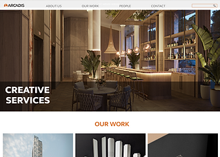
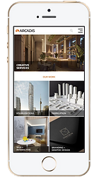
CREATIVE SERVICES
WEBSITE REDESIGN
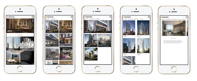
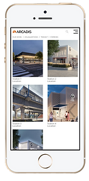
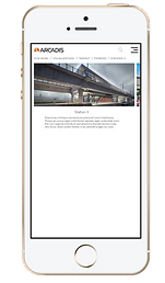
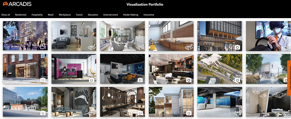
A current work project to redesign the department website that is used to showcase our work and to help designers and architects show their clients of our potential and capabilities. As the volume and quality of our work continue to grow, this also serves as an opportunity to promote new service offerings. I had to diagnose and identify some of the key problem areas of the previous site and create a new version that is more user friendly.
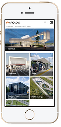
Arcadis Creative Services is an in-house team that is spread across Canada, the US and the UK. Their range of work covers visualization; fabrication; branding and graphic design; web and interactive; film and animation; and virtual experiences.
BRIEF
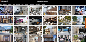
As the number of projects grow within our department, it became increasingly prevalent that we need to be able to showcase what we have done and show examples of relevant projects to both clients and designers.
Main objective: Increase usability and efficiency of sharing our work.
APPROACH
I followed the Double Diamond approach to identify the key issues and to provide solutions.

Discover
Heuristics analysis
Competitor analysis
Trend research
Moderated user testing

Define
Competitor UX benchmark
Identify top problems/pain points

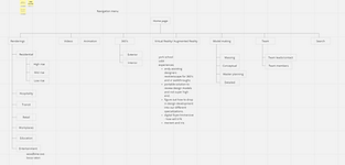
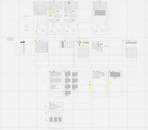
Develop
Card sorting
Tree testing
Organizing IA hierarchy
Wireframing
Dot voting

Deliver
Prototyping
User testing
Iteration
Handoff to developer
DISCOVER
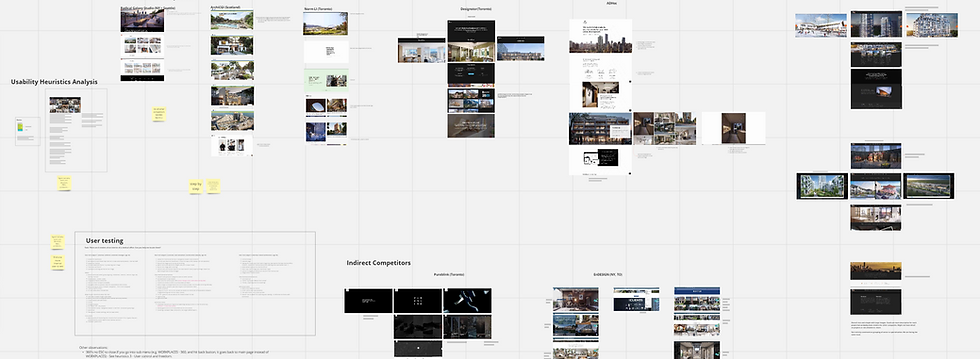
Heuristics Analysis
Moderated User Testing
Competitor Analysis
I began with a heuristics evaluation using Jakob Nielsen's 10 general principles for interaction design to identify some of the key usability issues of the current site and the impact on the overall user experience.
After identifying the key users of our site, I recruited some users from within the company such as designers and project managers who typically deal with clients to show them examples of what we do. I also recruited some users from outside the company who are in the building and construction industry as well as not within the industry to get a diverse range of feedback. I then assigned a few tasks to the users and noted their feedback.
I looked at some of our direct and indirect competitors to see if there are potential gaps or features that we might be missing as well as commonalities.
DEFINE
Identifying top problems/pain points
Cross referenced my findings of the heuristics evaluation and the key findings of the user tests to see where the overlaps are to pin point our key problem areas that cause users the most frustration.
DEVELOP
Card sorting and
tree testing
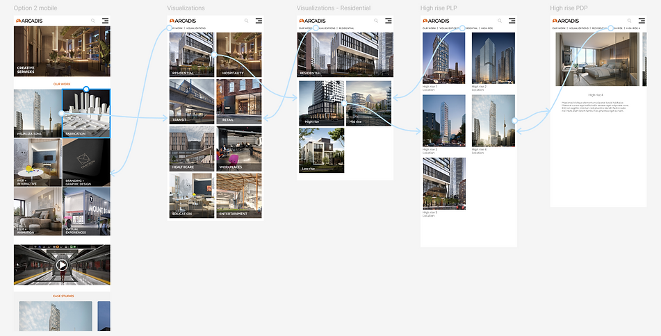
Wireframing and dot voting
I conducted card sorting and tree testing exercises on my user groups to help guide the information architecture of the new website.
I built multiple variations of low fidelity wireframes in mobile and web versions to present to my team. We would then vote on which option to move forward with. After this decision was taken, I proceeded to develop high fidelity wireframes and returned to the team for confirmation and revisions before developing prototypes.
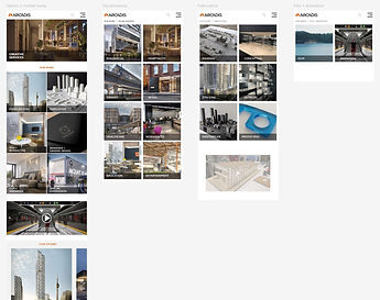
DELIVER
Prototyping and
User testing
I created prototypes for both the mobile and web versions to test on my user group. They were given the same tasks as in the very first round when we evaluated the current website. The time in which they were able to complete the tasks were crucial in determining whether the new design has succeeded. Their feedback were also taken into consideration to see if there are any immediate actions we can take to address any frustrations.